Dashboards
- Kim Rasmussen
- Kim Rasmussen (Unlicensed)
- Patrick Ahmed (Unlicensed)
Within the Ceptor Console, you can configure a number of dashboards.
A dashboard is a screen where you can select to display any number of charts, and infoboxes.
You can create dashboards suitable for display at large screen monitors, or customize various dashboards to keep an eye on performance, number of logins, errors etc.
Any statistics that are available within the statistics server can be used.
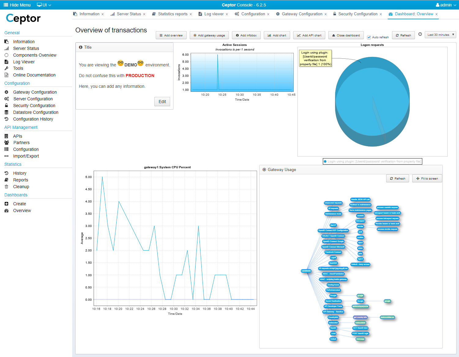
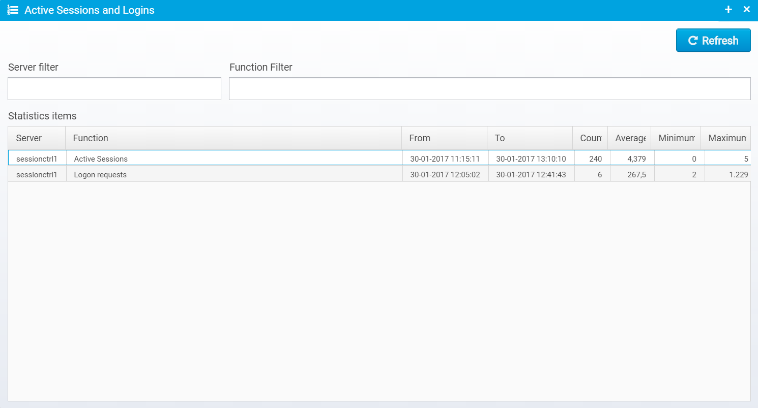
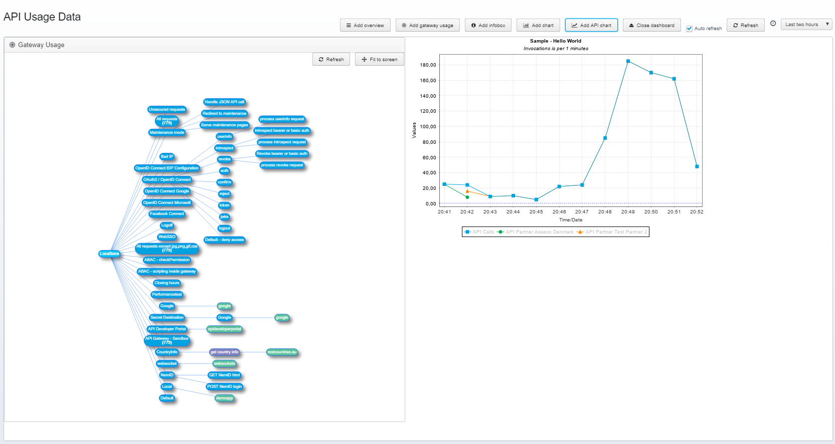
Below is an example dashboard. with an infobox, a gateway usage diagram, and a few charts charts added.
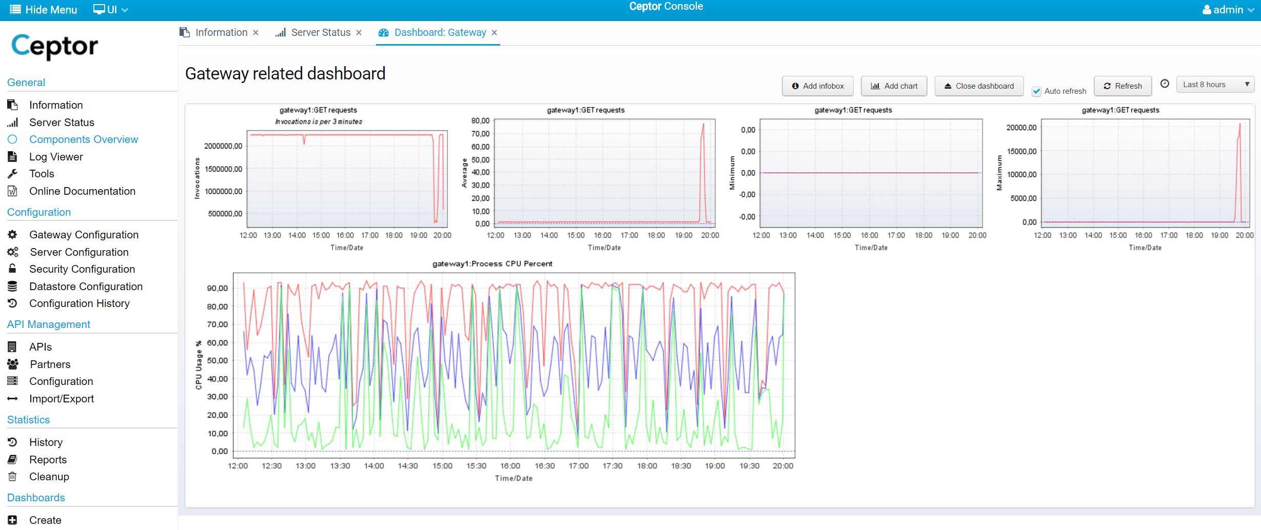
Here is another example, with number of requests, request execution time and CPU usage - the CPU chart has 3 plots defined, for Minimum, Average an Maximum CPU usage respectively.
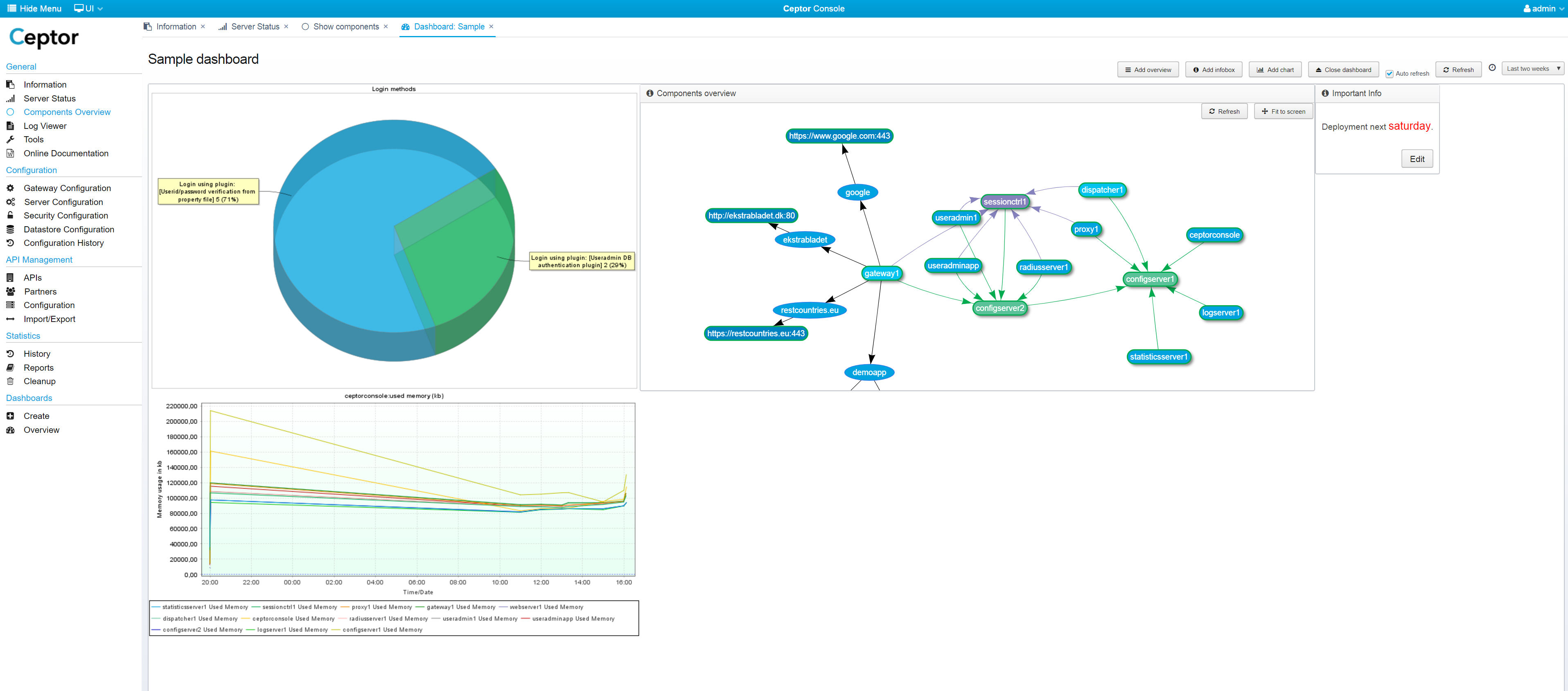
Components Overview
You can add an overview network graph, showing the various components, their status and how they connect to each other - see Components Overview for details.
Gateway Usage
You can add a diagram showing the usage of the various locations / pipelines / destinations configured in your gateway - it allows you to easily see which parts are used and how much - you can also see the response time. Double-clicking one of the items lead you to the gateway configuration for that particular location / pipeline / destination.
Below is an example of a dashboard that has both a gateway usage diagram and a components overview diagram added next to each other.
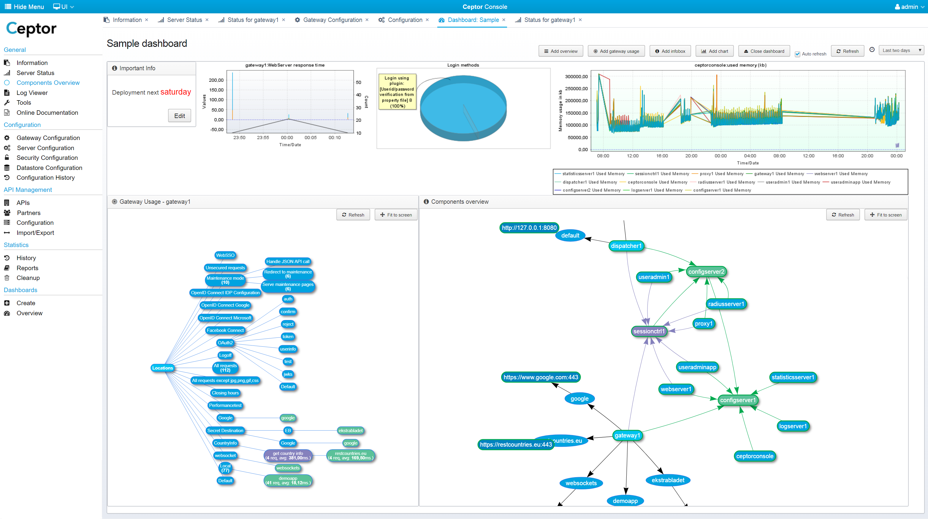
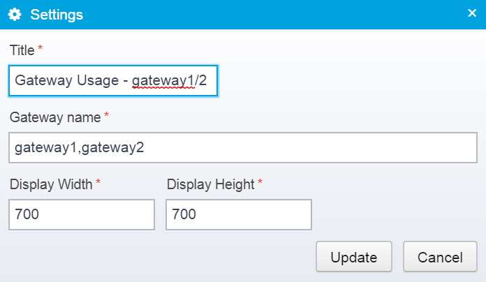
Right-click the diagram to change settings, including which gateway(s) the statistics are taken from - here is an example of specifying multiple gateways - both their statistics will be included in the same diagram.
Infobox
An infobox can show useful information, e.g. about the environment, it can contain a to-do list or whatever else information you want on your dashboard - it is just a plain HTML text that can be edited, if you really want to, you could also place an iframe with another embedded website within it.
Charts
You can add a new chart in a number of ways - e.g. from the Server Status showing remote statistics for a given server, you can click and add charts to an existing or new dashboard. You can also within the dashboard, click "Add chart" and you get this dialog:
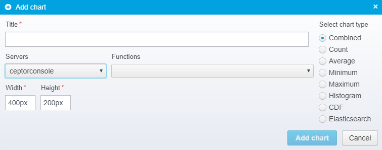
Here, you type in the basic information needed for a chart and add it to the dashboard.
If you want to change the details, add other plots, or specify wildcards for server or function names, you can right-click it and edit the settings for it.
You can drag the infoboxes and charts around to reorder them, and if you right-click them, you will get a popup menu like this:
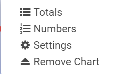
Totals
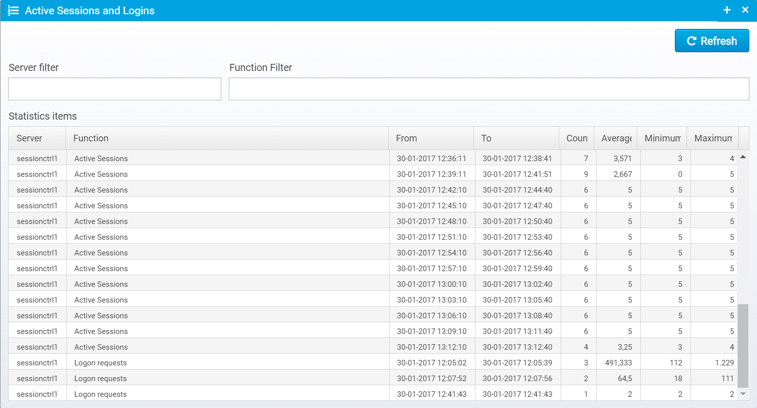
If you click "Totals" you will get a popup showing the total values for the statistics entries behind the graph
Numbers
Clicking on "Numbers" gives you a similar list, but with all the numbers behind the graph shown.
Settings
Clicking on "Settings" however opens up the possibility for changing everything about your chart, from title, color and size to which plots are shown, which statistics entries do they originate from, and what type of data to show.
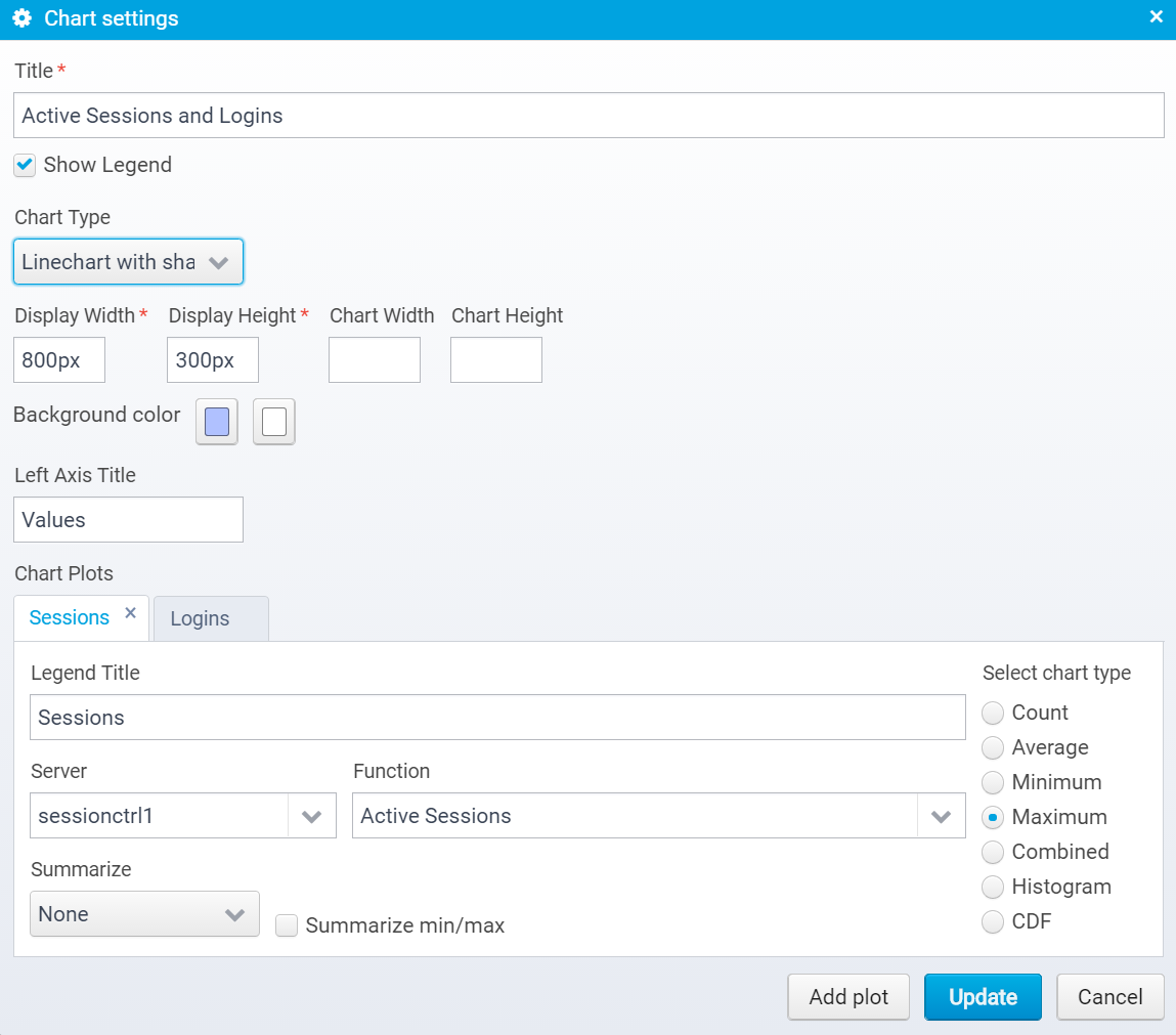
Following is a list of fields and explanations:
Title
The title of the chart.
Show Legend
If checked, a legend will be shown for each data plot with the legend title and the color for the plot
Chart Type
You can choose between:
- Linechart
Regular line chart. - Linechart with shapes
Line chart, but with shapes drawn for each measurement point. - Barchart
Bar chart. - Piechart
Pie chart, useful for showing e.g. number of logins of one type versus another type. - Stacked area chart
Stacked area chart, shows summed up area chart with plots stacked on top of each other.
Display width / height
The width / height of the display size - note that this is in HTML sizing, so it might be in pixels, or percentages
Chart width / height
The size of the chart in pixels - should be specified if display width / height is not in pixels - if not specified, a width of 800 and height of 500 pixels is used as default chart size - the shown image will be scaled to the display size.
Background color
Set the background color to a gradient between the two colors selected. Set them to the same color if you do not wish a gradient background.
Left Axis Title
Allows you to change the title of the left (Y) axis.
Chart Plots
One chart can contain multiple plots, enabling you to create one chart that shows information from many different statistics sources in one.
Legend Title
Title of the legend for the plot - here you can use the macros ${server} and ${function} which will be replaced with the name of the server / function the statistics originated from. This is especially useful if you use wildcards in the server / function names, so there might be multiple matches.
Server / Function
Here you can select or type the server and function to base the plot upon - you can use wildcards here - "Summarize" will determine what happens if there are multiple matches.
Select chart type
Here, you select which type of chart data you want to include in the plot, you have these options:
- Count
The number of invocations - the number of times a measurement was made using the server/function. - Average
The average value - made by summing up all measurements and dividing with count. - Minimum
The minimum / lowest value. - Maximum
The maximum value. - Combined
A combined chart, containing minimum, maximum, average and count on the same graph. Useful for a quick overview. - Histogram
Histogram chart - shows the distribution of measured values. - CDF
Cumulative Distribution Function plot of the data. - Elasticsearch
Display data from Elasticsearch, use with e.g. Ceptor API Management for analyzing APIs - see also API Usage / Analytics
Summarize
When you have more than one match on the wildcards of servers/function this determines how the data are summarized.
- None
No summary - one plot added per match. - All
All summarized into one, only a single plot added. - Server
Combined per server for all functions. - Function
Combined per function for all servers.
Note that this field has no effect for CDF, Histogram or Elasticsearch charts,
Summarize min/max
When summarizing data, the default is to pick the minimum / maximum value of each dataset and use that - if this is checked, however the minimum and maximum values will be summed up instead.
Imagine that you have a chart showing active sessions for server "*" - this matches e.g 2 servers, each in their own cluster, so in a given time period there will be measurements from 2 servers. If you want a chart showing the minimum combined number of sessions for both clusters summed up, you should check this box - otherwise you would get the minimum value for the single server with the lowest number.
Viewing API Usage and Elasticsearch Charts
Below is an example of a dashboard which includes a chart originating from Elasticsearch.
When using Ceptor API Management you should configure the /wiki/spaces/CEPTORINTERNAL/pages/982876769 to store API Usage data in Elasticsearch - see API Usage / Analytics and Setting up API Gateway for more information on how to do this.
There are several ways of creating a chart with data from Elasticsearch - one is to create an Elasticsearch query manually, another is to get Ceptor Console to do this for you.
If you click ![]() you get prompted to choose between an API, Partner and an Elasticsearch query to use as base for creating a chart.
you get prompted to choose between an API, Partner and an Elasticsearch query to use as base for creating a chart.
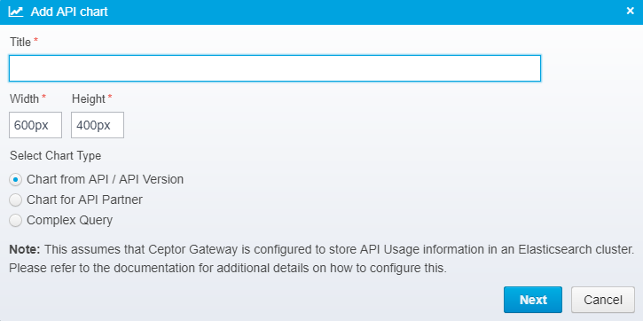
Here, type in a name and select a size for your chart - you can also choose between creating a chart for:
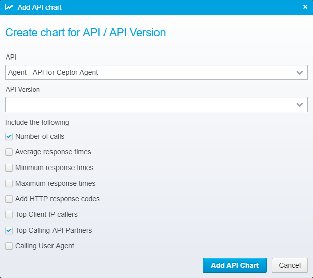
- API / API Version
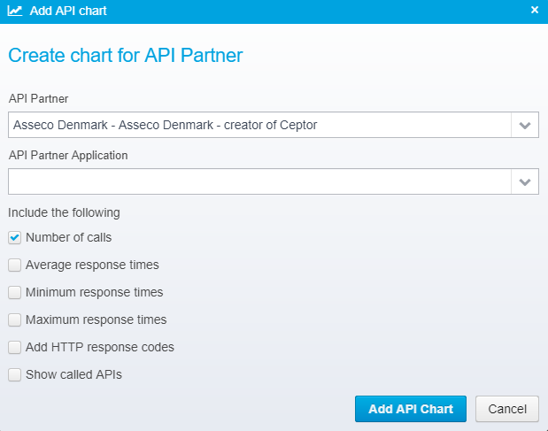
- API Partner
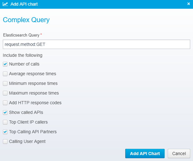
- Complex Query
When creating a chart for an API / API Version, you get to choose between the available APIs and you can optionally select a specific API Version as well - now, choose which elements you want to include in your Elasticsearch query, and thus in the chart.
When creating a chart for an API Partner, you must choose the partner, and optionally a specific API Partner Application - if no application is chosen, data for all the partners applications will be shown. Also select which elements you want to include in the Elasticseach query, e.g. which APIs the partner called, or the average response time.
Finally, you can choose Complex Query, and enter a specific query, e.g. request.method:GET to find all the matching API calls that were invoked using the HTTP GET method. You can also use complex Elasticsearch expressions, such as "(request.method:GET OR request.method:PUT) AND apipartner.name:Asseco" if you need more complex expressions.
Once the chart is created, you can right-click it and change its settings to modify the query.
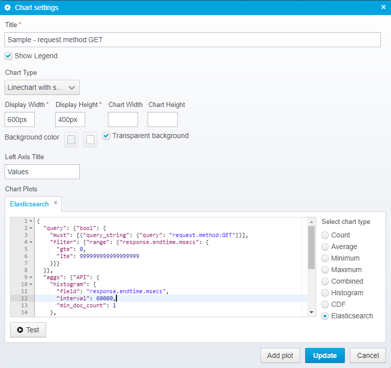
To try out any changes you make, click the Test button - this will send the query to Elasticsearch and display the output, e.g.
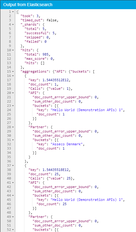
This allows you to verify that any changes you make manually to the query has the expected results - note that you can use any aggregations you want to archive the decided resulting dataset for the chart.
Looking Deeper Into the Query
The query has a specific structure with some elements that are needed.
{
  "query": {"bool": {
    "must": [{"query_string": {"query": "request.method:GET"}}],
    "filter": {"range": {"response.endtime.msecs": {
      "gte": 0,
      "lte": 999999999999999999
    }}}
  }},
  "aggs": {"API": {
    "histogram": {
      "field": "response.endtime.msecs",
      "interval": 60000,
      "min_doc_count": 1
    },
    "aggs": {
      "Calls": {"value_count": {"field": "response.endtime.msecs"}},
      "API": {"terms": {
        "field": "prettyname.keyword",
        "size": 100
      }},
      "Partner": {"terms": {
        "field": "apipartner.name.keyword",
        "size": 100
      }}
    }
  }}
}
First, the query with a bool, and a filter with a range is needed - Ceptor Console modifies the range to match the selected range for the dashboard.
Seconds, the aggs (aggregrations) with a histogram inside it is needed - the interval is likewise modified depending on the selected time period.
Other than that, you an add your own aggregations, and nested aggregrations - the names you use will be reflected in the chart on the legend shown.
If you e.g. wish to view the average response time not overall, but per HTTP return code, you can adjust the query to the one below:
{
  "query": {"bool": {
    "must": [{"query_string": {"query": "request.method:GET"}}],
    "filter": {"range": {"response.endtime.msecs": {
      "gte": 0,
      "lte": 999999999999999999
    }}}
  }},
  "aggs": {"API": {
    "histogram": {
      "field": "response.endtime.msecs",
      "interval": 60000,
      "min_doc_count": 1
    },
    "aggs": {
      "HTTP Status": {
          "terms": {
              "field": "response.status",
              "size": 10
          },
          "aggs": {
              "Calls": {"value_count": {"field": "response.endtime.msecs"}},
              "API": {"terms": {
                "field": "prettyname.keyword",
                "size": 100
              }},
              "Partner": {"terms": {
                "field": "apipartner.name.keyword",
                "size": 100
              }}
          }
      }
    }
  }}
}
This will give you a different chart like the one below:
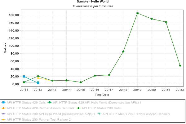
With the number of calls and Top 10 partners for each HTTP response code in the Top 10 list.
To configure Ceptor Console to be able to retrieve data from an Elasticsearch cluster, you need these settings defined for the console, with url, userid and password changed to fit your requirements
<group name="elasticsearch" description="Elasticsearch related settings">
	<property name="elasticsearch.enabled" value="true" description="Set to true to enable Elasticsearch integration"/>
	<property name="elasticsearch.password" value="" description="Elasticsearch password"/>
	<property name="elasticsearch.searchindex" value="ceptor" description="Elasticsearch index name/alias used for searching"/>
	<property name="elasticsearch.url" value="http://localhost:9200" description="URL for the Elasticsearch server"/>
	<property name="elasticsearch.userid" value="" description="Elasticsearch userid"/>
</group>
© Ceptor ApS. All Rights Reserved.