...
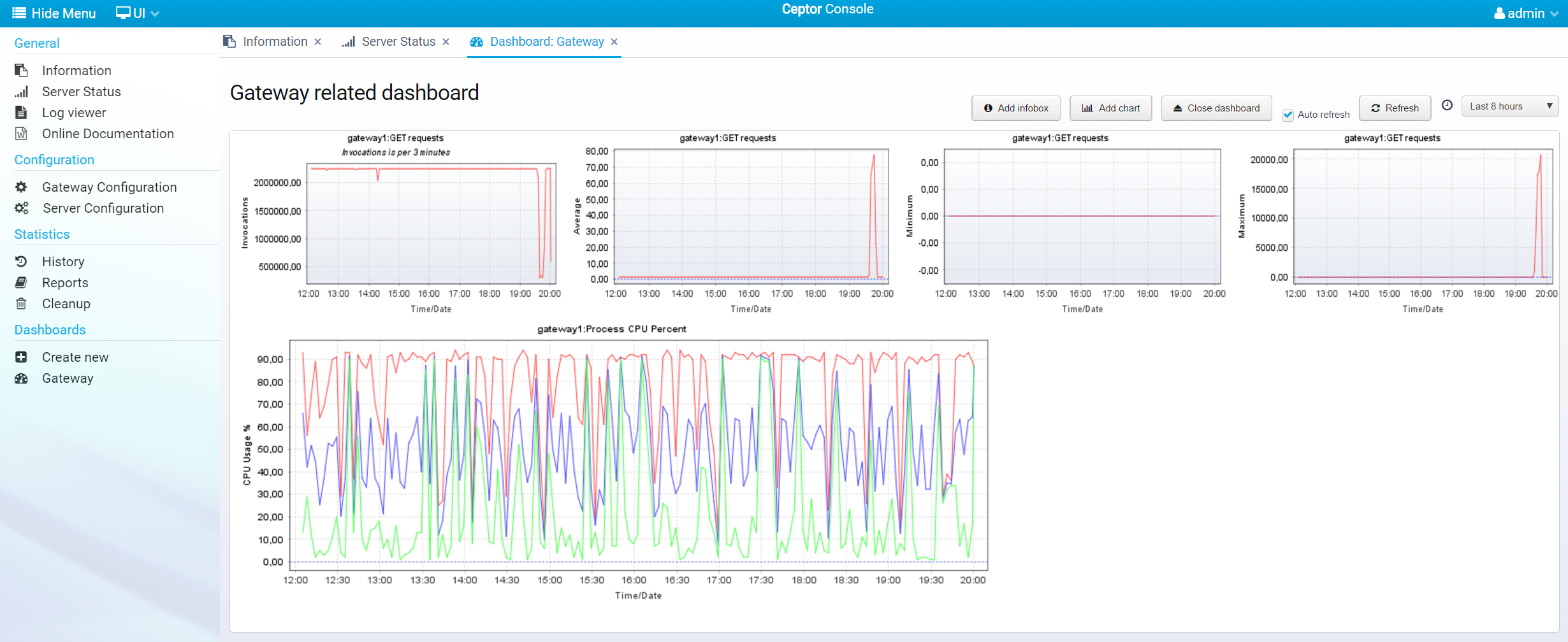
Here is another example, with number of requests, request execution time and CPU usage - the CPU chart has 3 plots defined, for Minimum, Average an Maximum CPU usage respectively.
Components
...
Overview
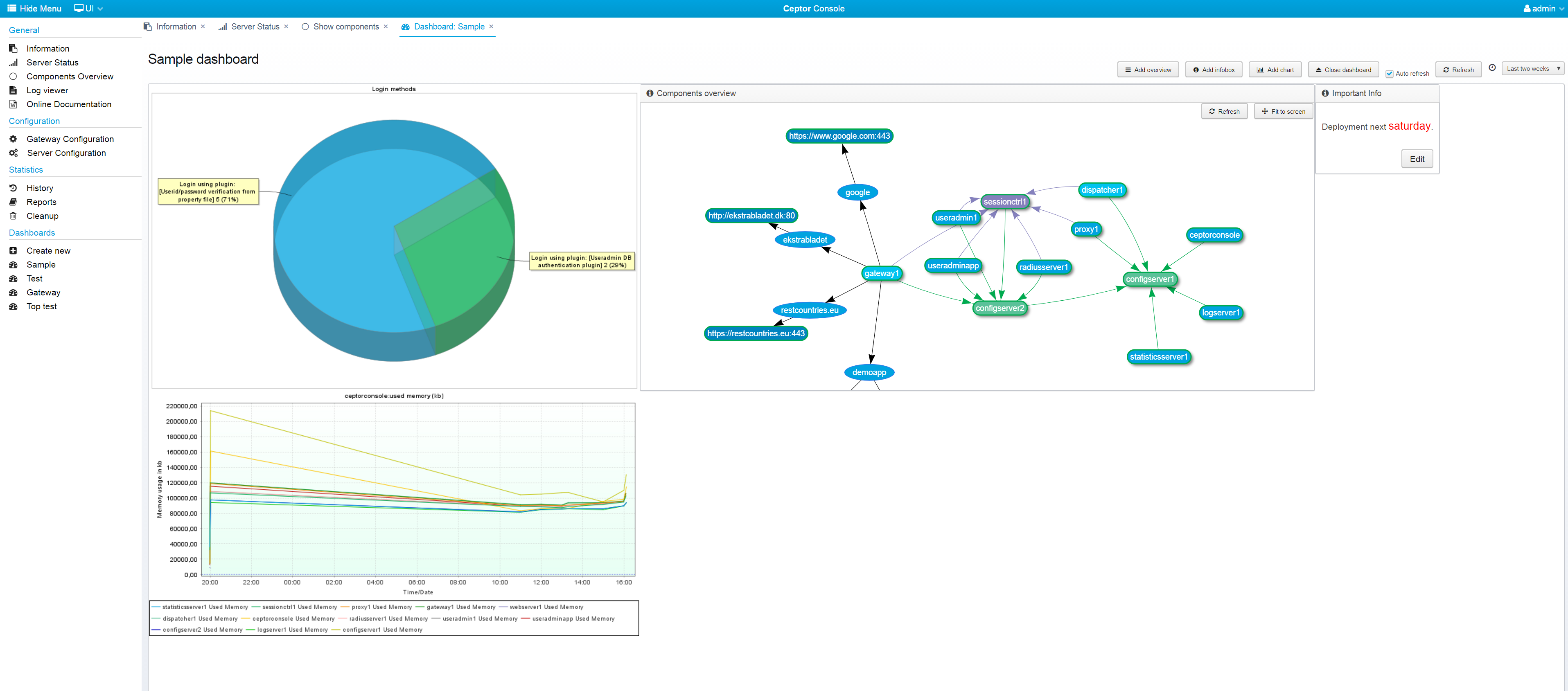
You can add an overview network graph, showing the various components, their status and how they connect to each other - see Components Overview for details.
Gateway
...
Usage
You can add a diagram showing the usage of the various locations / pipelines / destinations configured in your gateway - it allows you to easily see which parts are used and how much - you can also see the response time. Double-clicking one of the items lead you to the gateway configuration for that particular location / pipeline / destination.
...
- Linechart
Regular line chart. - Linechart with shapes
Line chart, but with shapes drawn for each measurement point point. - Barchart
Bar chart. - Piechart
Pie chart, useful for showing e.g. number of logins of one type versus another type. - Stacked area chart
Stacked area chart, shows summed up area chart with plots stacked on top of each other.
...
- Count
The number of invocations - the number of times a measurement was made using the server/function. - Average
The average value - made by summing up all measurements and dividing with count. - Minimum
The minimum / lowest value. - Maximum
The maximum value value. - Combined
A combined chart, containing minimum, maximum, average and count on the same graph. Useful for a quick overview. - Histogram
Histogram chart - shows the distribution of measured values. - CDF
Cumulative Distribution Function plot of the data. - Elasticsearch
Display data from Elasticsearch, use with e.g. Ceptor API Management for analyzing APIs - see also API Usage / Analytics
...
- None
No summary - one plot added per match . - All
All summarized into one, only a single plot added . - Server
Combined per server for all functions. - Function
Combined per function for all servers .
Note that this field has no effect for CDF, Histogram or Elasticsearch charts,
...
Imagine that you have a chart showing active sessions for server "*" - this matches e.g 2 servers, each in their own cluster, so in a given time period there will be measurements from 2 servers. If you want a chart showing the minimum combined number of sessions for both clusters summed up, you should check this box - otherwise you would get the minimum value for the single server with the lowest number.
Viewing API Usage and Elasticsearch
...
Charts
Below is an example of a dashboard which includes a chart originating from Elasticsearch.
...
This allows you to verify that any changes you make manually to the query has the expected results - note that you can use any aggregations you want to archive the decided resulting dataset for the chart.
Looking
...
Deeper Into the
...
Query
The query has a specific structure with some elements that are needed.
...